In this article, we will give you a general overview and some tips on how to get the most out of the PPM Express Resource Management Report Pack.
PPM Express Resource Management Reports allow analyzing the values and interrelations of the following main metrics:
- Capacity
- Planned
- Actual
- Scheduled
- Completed
Capacity
Capacity – is the total value of the resource working hours for a certain period.
The formula for calculating the value of the resource Capacity is the following:
( if ResourceExceptionHours is defined then ResourceExceptionHours will be used
else if TenantExceptionHours is defined then TenantExceptionHours will be used
else if ResourceDefaultHours is defined then ResourceDefaultHours will be used
elseTenantDefaultHours will be used) * ([Max Units, %]/100) * ((100 - [Non Project Work, %])/100)
Where:
- Max Units, % - is the value from the 'Details' Resource dashboard section.
- ResourceExceptionHours – are the values for a certain date in the 'Calendar Exception' Resource dashboard section.
- TenantExceptionHours – are the values in the 'Exceptions' section of the Calendar settings for a certain date.
- ResourceDefaultHours – are the values for a certain date in the ‘Work Week’ Resource dashboard section.
- TenantDefaultHours – are the values for a certain date in the ‘Default work week’ section of the Calendar settings.
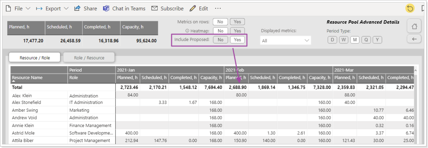
Planned
Planned – is the total value of the Committed and/or Proposed hours allocated for the resource. This is the value from the 'Utilization' Resource dashboard section.
If the “Include Proposed” option is set to “No”, then the following formula calculates the Planned value:
- Planned = Committed
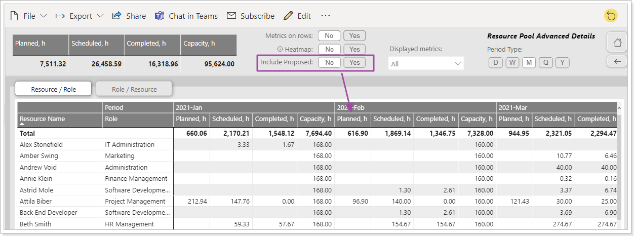
If the “Include Proposed” option is set to “Yes” then the Planned value is calculated by the following formula:
- Planned = Committed + Proposed
Actual
Actual – is the total value of the Actual hours allocated for the resource. This is the value from the 'Utilization' Resource dashboard section.

Scheduled, Completed
The data source for the Scheduled and Completed metrics are Effort and Completed Work of the task on the Project Tasks page (Task Viewer).

These values are broken down in the reports according to the following logic:
- Hours/ (DueDate – StartDate) / AssigneesNumber
For example (for the above screenshot), the metric values for each of the 3 assignees for each date between 2020-10-21 and 2020-11-04 will be calculated as follows:
- Scheduled = 46 / (2020-10-21 – 2020-11-04) / 3 assignees = 46 / 15 days / 3 assignees = 1,0222h
- Completed = 24 / (2020-10-21 – 2020-11-04) / 3 assignees = 24 / 15 days / 3 assignees = 0.5333h
If a task has both StartDate and DueDate not set and/or no resources are assigned to a task, then the values of the Completed Work and Effort fields of such a task will be ignored in the calculations.
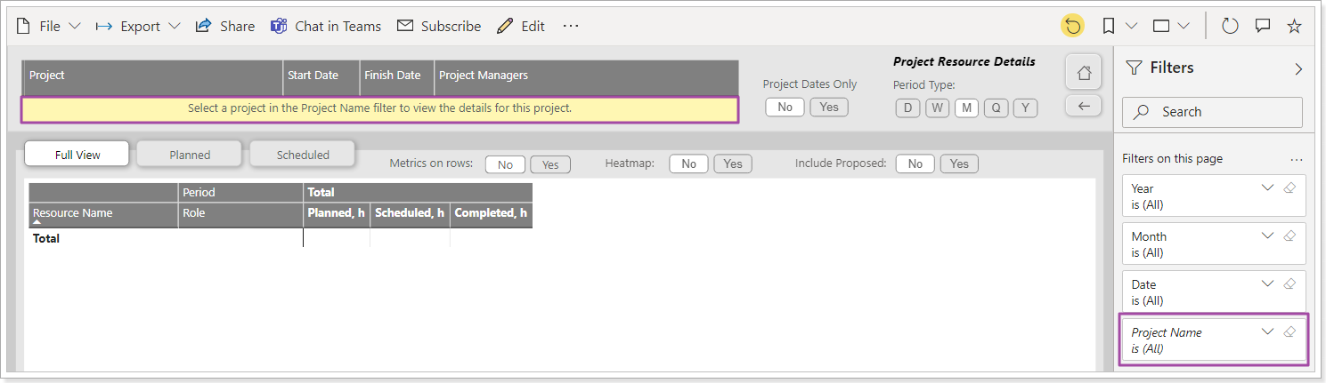
Single project/resource reports
Several reports of the pack are designed to view the details of one selected project/resource.
If no project/resource is selected in such a report, or more than one is selected, then the report will be empty, and the user will be prompted to make a choice:
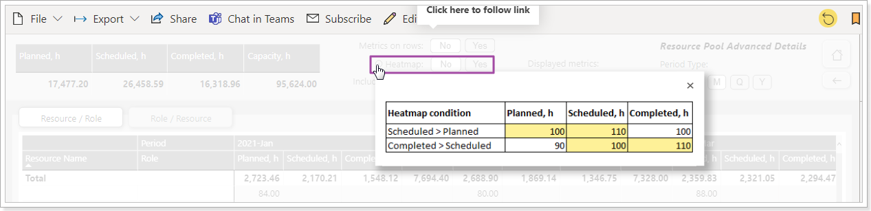
Heatmap toggle
Some of the reports are equipped with a ‘Heatmap’ toggle:
If the Heatmap value is = Yes, then:
- the value of the Scheduled - Planned pair is highlighted in yellow if Scheduled > Planned
- the value of the Completed - Scheduled pair is highlighted in yellow if Completed > Scheduled
The logic of the color indication is represented by the corresponding explanation:
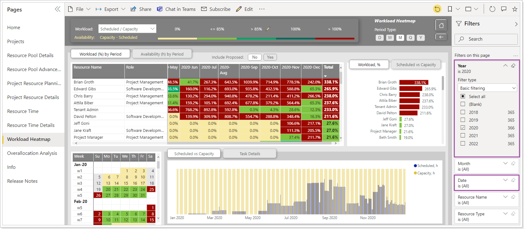
Workload Heatmap report
The report provides a toolkit for assessing the degree of the workload of resources by means of the corresponding color indication of the calculated values, as well as the ability to view the details of the workload by Project / Source Type / Task for a selected period of time.
The workload is a ratio of two metrics, where Capacity is the denominator and the numerator is one of the following metrics: Planned, Actual, Scheduled, and Completed.
Working with the report begins with defining the appropriate formula for calculating Workload by selecting it from the list:
There are four options available: Planned/Capacity, Actual/Capacity, Scheduled/Capacity, Completed/Capacity.

One of the predefined colors is used to indicate Workload:
If the values 0%, 100%, and > 100% are fixed, then the values <= 85% and > 85% can be overridden using the corresponding button:

The report consists of the following main parts:
1. A table where the Workload value is broken down by Resource and Period.
2. A table where the Availability value is broken down by Resource and Period.
The Availability metric can be displayed either in hours or in FTE. The selected metric affects not only the values shown in the table but also the content of the contextual tooltip, which updates accordingly.

3. Bar chart representing Workload (%) for the selected time period broken down by Resource.
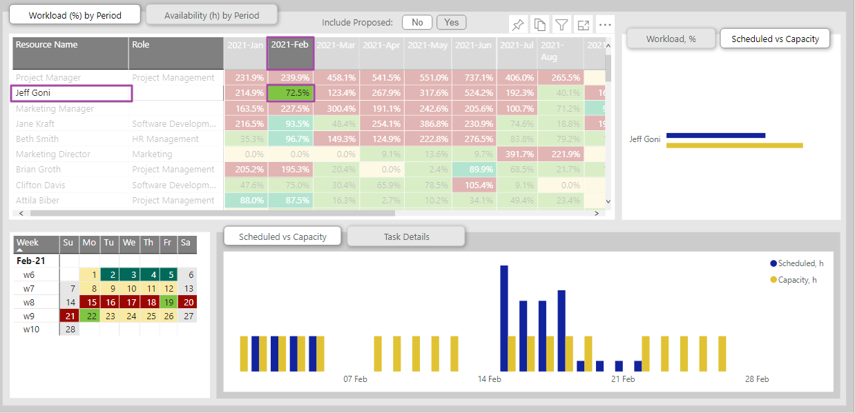
4. Bar chart representing pairs of metrics that determine/form the value of Workload: Planned vs Capacity, Actual vs Capacity, Scheduled vs Capacity, Completed vs Capacity. Metric values are specified in hours and broken down by Resource.
5. Calendar view. Calendar dates are color-coded according to the Workload value for each date.
6. Column chart, representing pairs of metrics that determine/form the value of Workload: Planned vs Capacity, Actual vs Capacity, Scheduled vs Capacity, Completed vs Capacity. Metric values are given in hours and broken down by Date.
7. A table where the values of all metrics for the current period are broken down by Project, Source Type, and Task.

Workload Heatmap report Q&A
Question 1
When we open the report in the filter panel, we see the following dates in the Date field. Where do these dates come from?
“This year“ date filter is applied by default, so we see the start and end dates of the current year in the Date filter.
Question 2
How to see data for several years if there is no way to select the desired value since filter 'Year' contains only one value - 2021 (current year)?
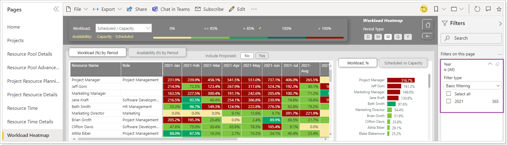
To select several years perform the following:
Remove the Date filter first by clicking on the eraser button:
Then apply the required Year filter:
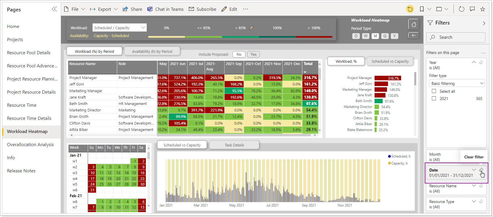
Question 3
The Workload values in Table 6 are sorted in descending order of the Totals column. Clicking on the heading of the corresponding column of the table does not change the sorting of the rows. The rows are still sorted by the value of the Totals column.
How is it possible to sort the Workload values for a specific period?
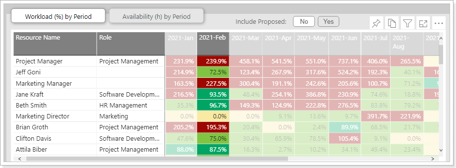
Option 1:
Narrow the current time frame down the targeted/needed period. The resources will be sorted the way you want.
Option 2:
When you click on the header of a column with data for a certain period, the bar chart on the right will display the corresponding Workload values for the same period, sorted in the desired order:
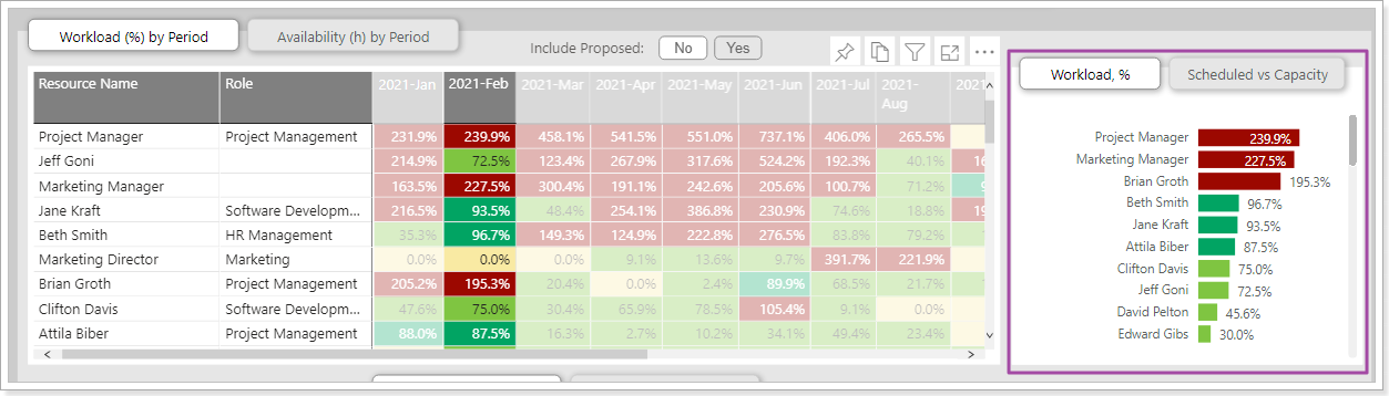
Question 4
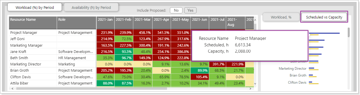
On the bar chart on the right, there are the Workload values for each resource for the selected period. Workload values are represented as percentages. How is it possible to get information about the hours that the displayed Workload values are based on?
Firstly, the bar chart is equipped with a tooltip, displaying the metric values:
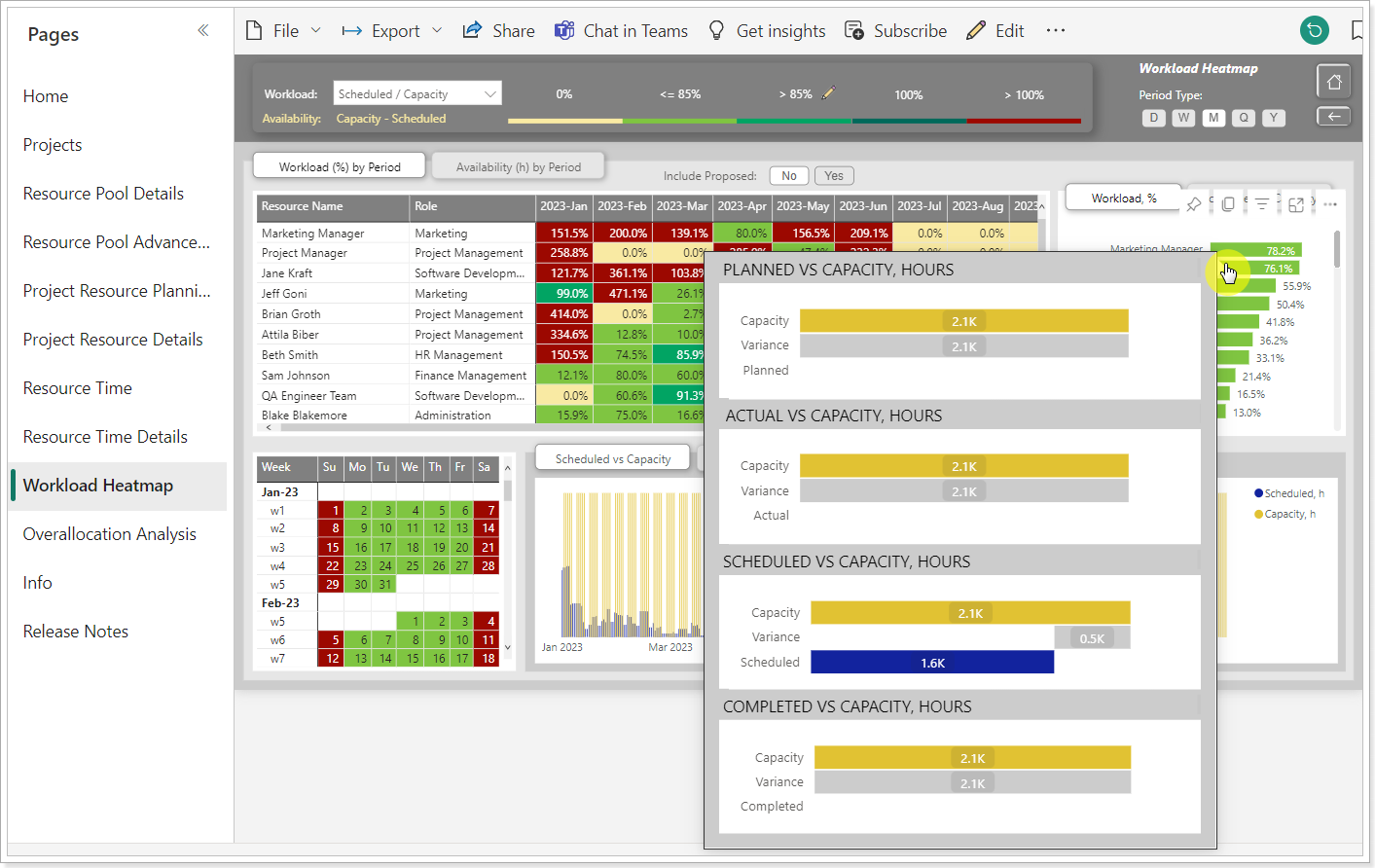
Secondly, it is possible to select the bar chart representation where the metric values appear as hours.
Question 5
To get information about the Workload of a resource for a certain period, it is required to click on the corresponding cell of the table.
The adjacent visuals got filtered, displaying data for the selected resource for a certain period, as expected. But when we click on the date of interest in the Calendar View, the resource filter and the period filter are reset. There is only a filter by the selected date left.
Is there a way not only to replace filters but also to add them?
To add the previously applied filter and the new one, hold down the CTRL key while clicking on the visual you are interested in. An additional click on an already filtered visual while holding down the CTRL key will remove the filter from this visual, but retain the other imposed filters.
Question 6
The table on the Tasks Details tab, among others, contains both the "Completed, h" and "Task Completed, h" columns.
What is the difference? And what is the difference between the columns “Scheduled, h” and “Task Effort, h”
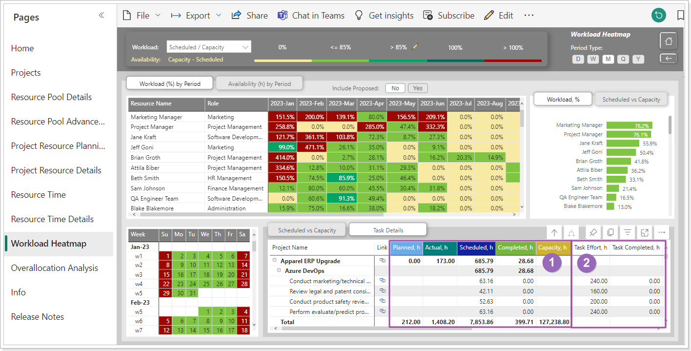
On the screenshot above, the columns of block # 1 display data corresponding to the current period. Columns of block # 2 display task data without breakdown into periods, the same values are presented in the corresponding task fields in the Task Viewer.
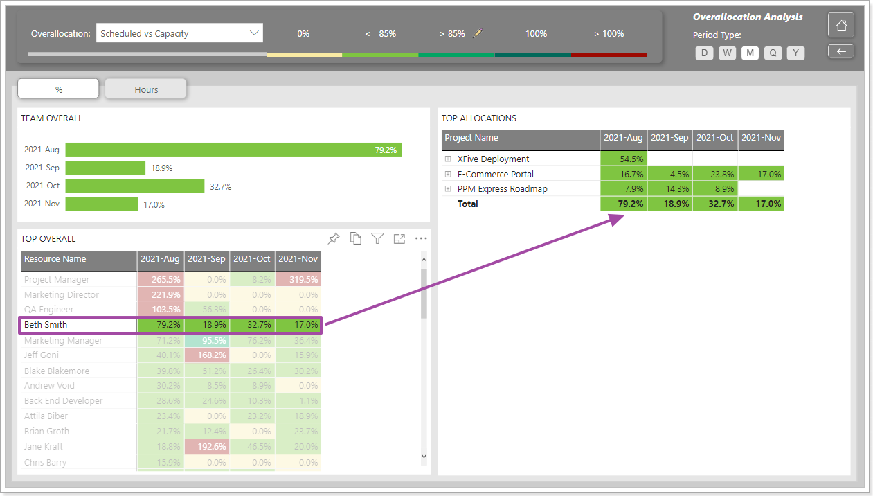
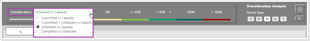
Overallocation Analysis report
The purpose of the report is to assess the overallocation of the Team.
Filters for forming a team are presented on the filter panel:
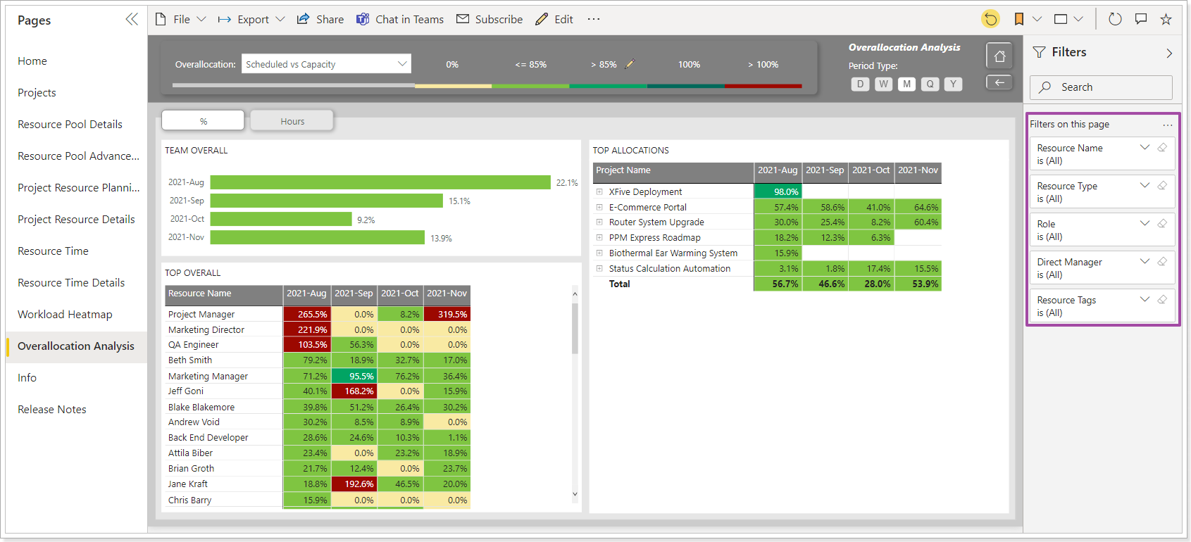
Just like in the Workload Heatmap report, Overallocation values are calculated using formulas. However, in the Overallocation Analysis report, the list of formulas is different:
If in the Workload Heatmap report, the time frame can be changed the way you need, then in the Overallocation Analysis report the width of the time frame is always equal to 4 periods.
The concept of a period in this report is linked with the concept of Period Type:

If Period Type = D (day), then the report will display data for today and for the next three days:

If Period Type = W (week), then the report will display data for the current week and for three weeks following the current one. If Period Type = M (Month), then the report will display data for the current month and for three months following the current one, etc.
The report is presented on two tabs.
The first one shows the Overallocation values calculated using the selected formula. Overallocation is presented as a percentage.
On the second - the values of the metrics that define the Overallocation formula. Metric values are presented in hours.
Resources are sorted by descending Overallocation value in the first (current) period.
Projects are sorted in descending order by Overallocation values in the first (current) period.

Clicking on resource filters projects in which this resource is involved.