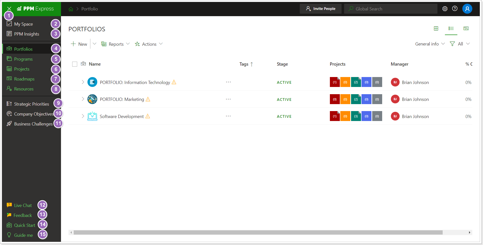
In this article, we will review the general interface layout in PPM Express.
Upper ribbon
1. Home button.
2. Global Search to find specific portfolios, projects, programs, resources, etc.
3. PPM Express Settings menu. It gives access to the People management, Tenant settings, PPM Insights, Calendar, Billing, Archived Projects, Automation, and Reporting pages.
4. Help section button.
5. User account menu. It contains a sign-out option, a switch between tenants (if you have several), and email notification settings.

Left navigation bar
1. Expand the left navigational menu button. Expands or collides left navigational menu.
2. My Space button.
3. PPM Insights button.
4. Portfolios button.
5. Programs button.
6. Projects button.
7. Roadmaps button.
8. Resources button.
9. Strategic Priorities button.
10. Company Objectives button.
11. Business Challenges button.
12. Live Chat.
13. Feedback.
14. Quick Start page.
15. Guide me.

Common page elements
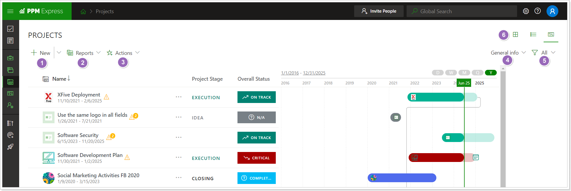
1. New dropdown. Allows quickly adding a new Project, Program, Portfolio, Resource, and Roadmap (depending on the page you are working on).
2. Reports dropdown. Lists available Power BI reports. Click the report title to be redirected to the report in a new tab if you have configured external Power BI reports.
3. Actions dropdown. Lists available actions for the current page.
4. View selector. If the card view is selected for the current page, it switches between the Cost and Work representation. Other views are available on the configurable table/timeline for configuring page representation.
5. Filter dropdown. Allows filtering elements on the page and creating new filter presets.
6. Card/Configurable table/Timeline general view switch. Changes current page representation.

Please refer to this article to find information about warnings in PPM Express.
